Outlook, rebuilt for the mobile web
For many people Outlook in a mobile browser was the only way in, on a shared phone, a phone without space for the app or a first connection, and the experience had fallen years behind. As the first designer on the team, I redesigned the Mail experience and its Search, contributed Quick Capture to the Calendar, and established Fabric for the mobile web (now Fluent UI), the design system under them.
- Team
- Microsoft
- Role
- Product Designer
- Timeline
- 2018 to 2020
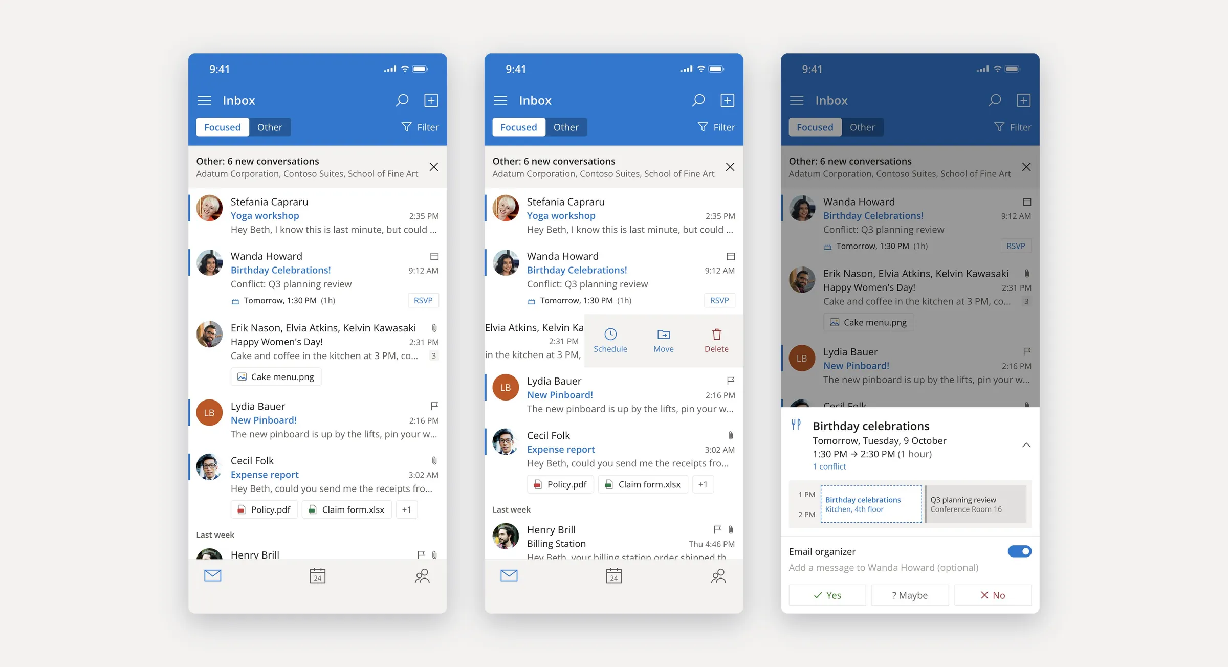
I designed the inbox for the browser instead of porting the app's patterns, which would have been quicker and wrong for borrowed phones and slow connections: Focused and Other sorting on Microsoft's intelligence APIs, sender photos for scanning, swipe actions and invites answered from the list. Research turned up a need nobody had scoped, translation, and it shipped with the new conversation view, where a thread stays whole.
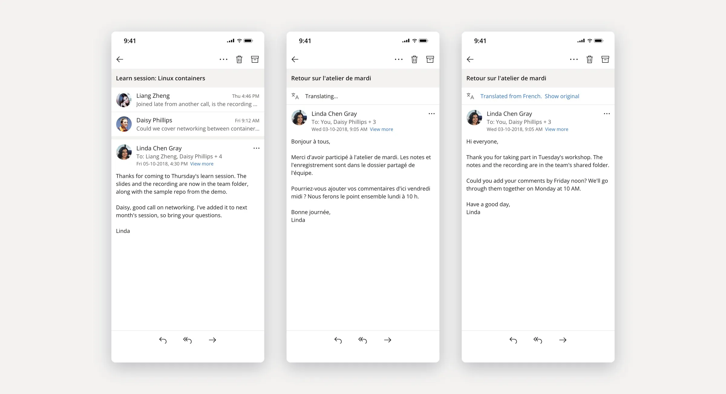
Conversation and translation
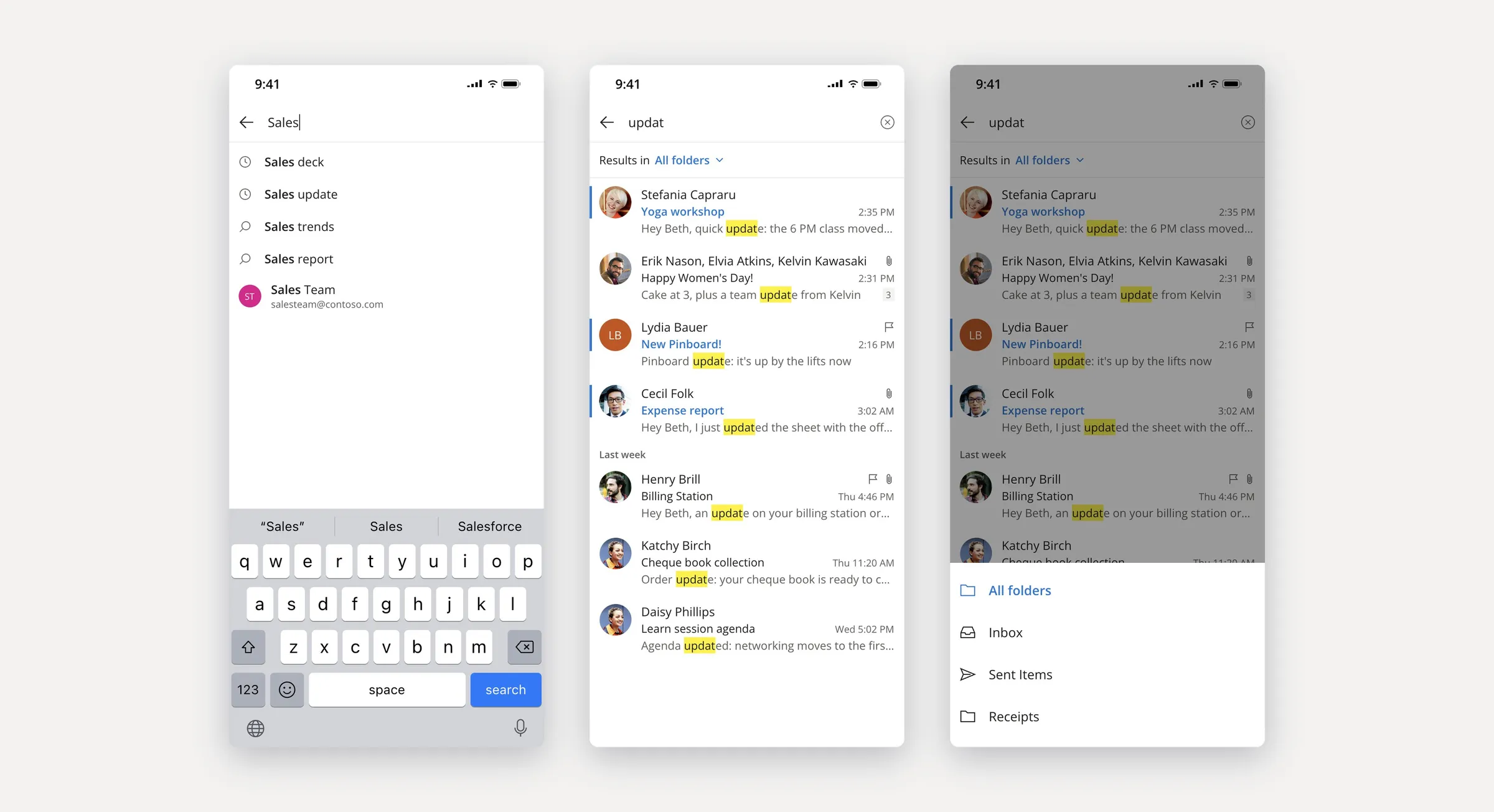
Search
Search suggests as you type, highlights each match in the results and can be narrowed to a single folder.
Calendar
The organisation assumed the calendar was mainly for scheduling meetings, but user research and interviews showed that most people were using it to capture reminders, so I gave that its own flow instead of a meeting form for everyone. Quick capture takes a title, a time and a place in one sheet over the calendar and saves without leaving the week.
Design system
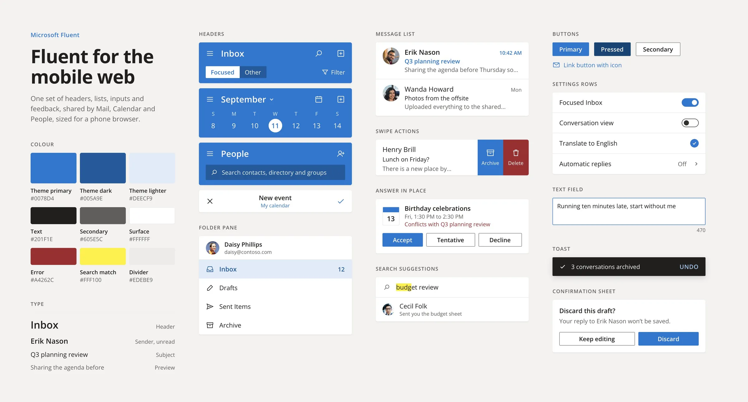
I established Fabric for the mobile web, one set of headers, lists, controls and feedback shared by Mail, Calendar and People, so every experience the growing design team added after me was built from the same parts and held to the same standard. I also set the design vision for bringing Outlook to the next billion people on KaiOS.